Why we changed our look

So many people have told me over the years how much they love our floral bright labels and how they look great on their shelves and bathrooms so it's been a nail-biting exercise making this big change, wondering how everyone will respond. Will they say I am mad, will they (like my sister) ask if I can do special runs for them so they can continue to have the old Agnes & Me look they love, (the answer is no :) or will they fall in love with the new look like I have?
Granted, because of the Covid madness of the last wee while I have had an extra 10 months to get used to the new look since everything has been delayed a few times with lockdowns and recent life in general so if you are on the fence now, soon you will not be!

There have been a number of drivers for changing. First, the original logo and label were created in quite a hurry with minimal thought on my part — it was replacing something I had made myself, using a photo taken (possibly with copyright issues) from the internet for a hastily arranged market. We turned to Sarah, who had designed a book cover for one of my husband’s books, and she did an amazing job creating the brand look we have used for the past four years and which I have loved to bits.
In the beginning I only had a few products (I know there are not many more now) but by the time I was releasing my best selling Restorative Serum last year we were running into issues with being able to creative distinctive differences between each product in terms of the colours we used — who would have thought of that? Well probably most companies but I was a nurse with no five-year business plan or idea where I was going.
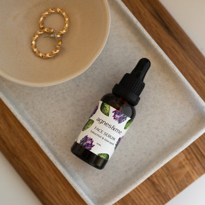
And while I love our floral look, the flowers and plants on our logo and labels did not represent the hero ingredients in the products. And while I love flowers and floral images I also realise that I am a minimalist at heart, a fact that was pointed out to me when a friend and maker, Marcia from Composed Confusion, made her most minimalist plant holder and called it Deirdre!!
So I wanted a fresher, cleaner, botanical look that incorporated my hero ingredients and I found such an amazing pair of women in Taranaki to do that. My brief to the very talented Ezra was to create a clean new look but to keep the flowers — and she made it even better than I could ever have imagined. I had warned her that I was difficult to work with and would probably takes days to digest whatever she sent as I have learnt on this journey that I need to allow change to settle before acting.

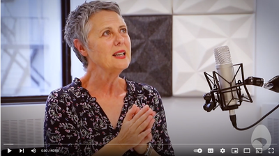
When the first draft came into my inbox I was on a zoom call with my business coach and I was so nervous I had to send it to her to open as I didn't want to derail our call with a mad reaction but she loved it, made me look and I loved it from the moment I saw it.
And then when Ezra told me it was her mother who had hand-painted the images it was just the perfect alignment with my brand, which is named for my mother, Agnes.
I hope you love it too.